The most authoritative data-viz writing on the web (and the people behind it)
Get an email when we publish a new post. No account needed, unsubscribe anytime.
The 5 most interesting data visualizations on display
1. data.who.int — the global health dashboard
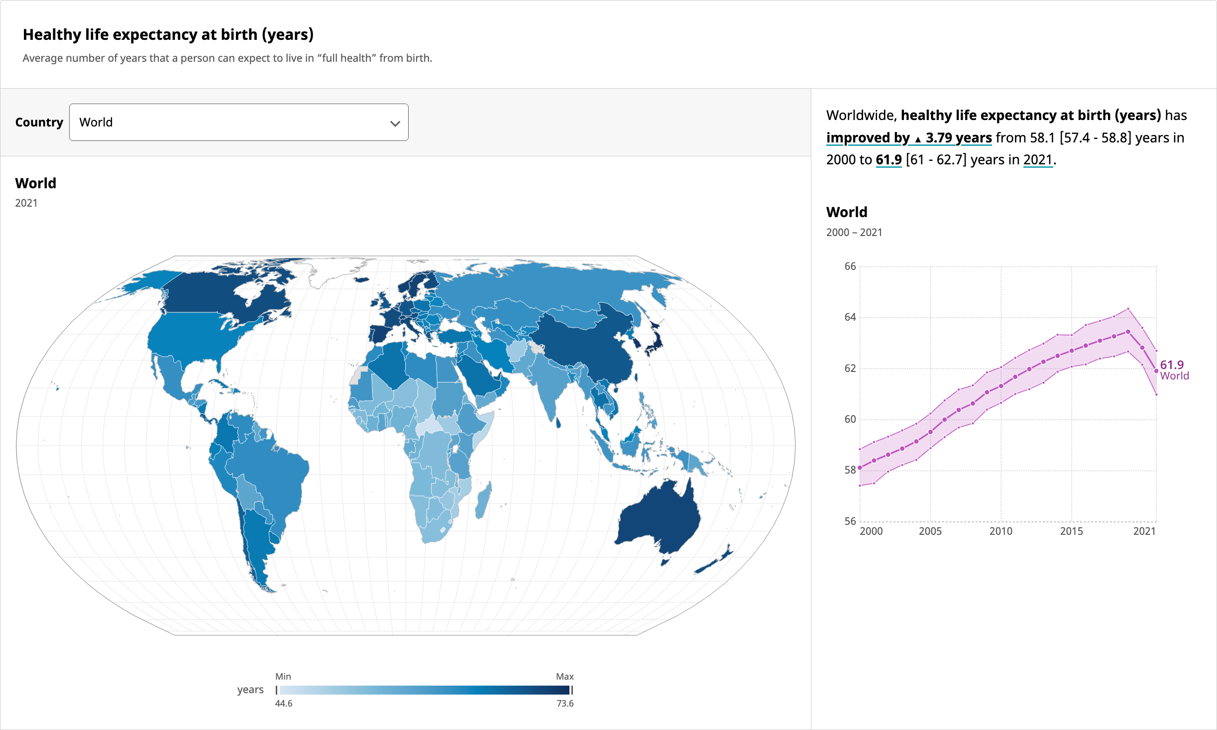 Built by 9elements for the World Health Organization, data.who.int is the official front door to global mortality, disease burden, immunization coverage, and life-expectancy data. The writeup is unusually candid about the constraints: Observable Plot under the hood, an accessibility pass that the WHO required before sign-off, and a deliberate choice to expose raw indicators with very little chart-junk on top. It's the most consequential single dataviz project surfaced anywhere in our corpus — billions of users indirectly, public-health policy directly.
2. Animated dplyr verbs — Andrew Heiss
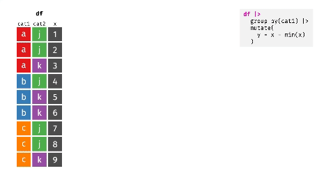 If you've taught R to anyone in the last two years, you've sent them this post. Andrew Heiss takes the four most-misunderstood verbs in dplyr —
 mutate(), summarize(), group_by(), ungroup() — and turns each one into a tiny animation that shows exactly how it shuffles the rows of a tibble. It's the rare piece of pedagogical dataviz that earned its viral run by being correct and clearer than the documentation it explains.
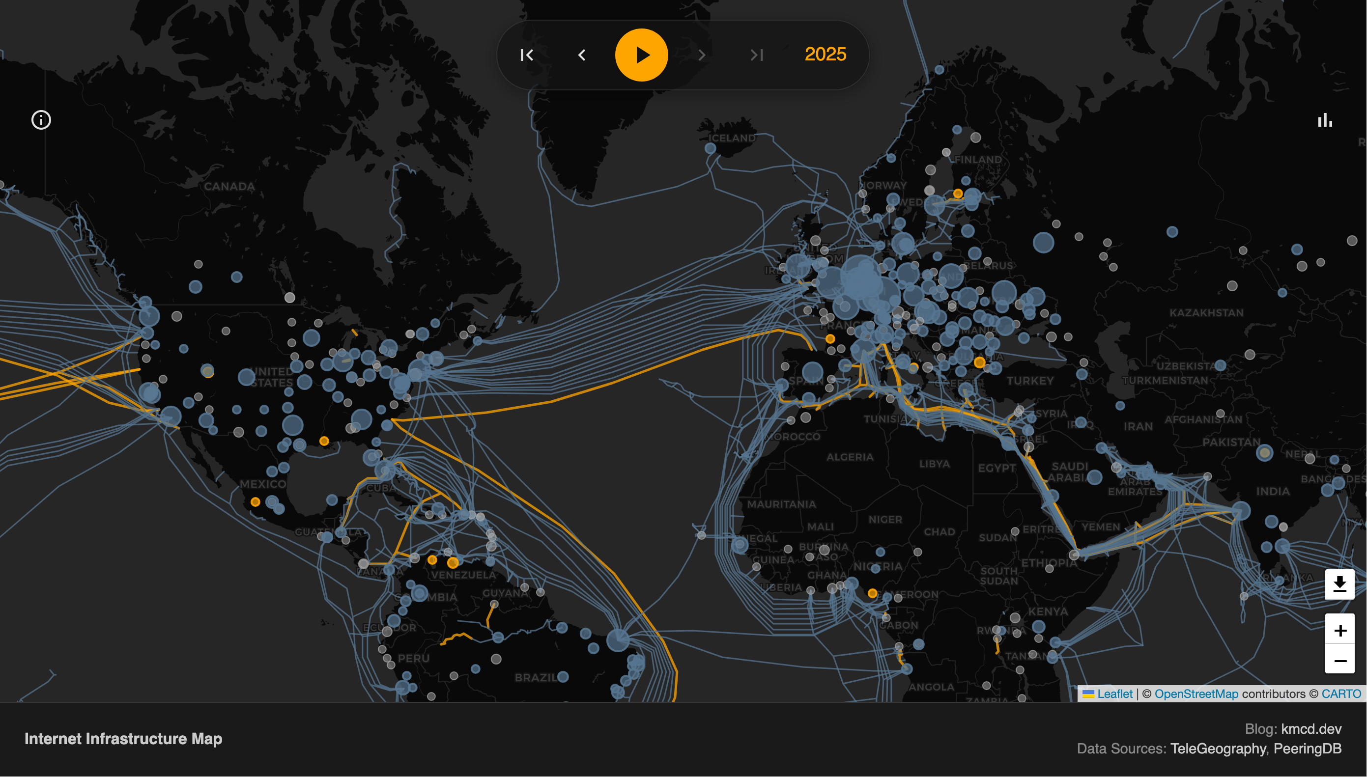
3. Visualizing the Internet (2025) — kmcd.dev
kmcd.dev's annual Visualizing the Internet is a treemap of where global Internet traffic actually goes — platform concentration, bandwidth allocation, the slow-motion consolidation of the open web into \~12 destinations. It's the rare dataviz that holds up year-over-year because the underlying data shifts meaningfully every twelve months. The 2025 edition reads as a quiet eulogy for the long tail.
4. The text-embeddings explorer — MotherDuck × marimo
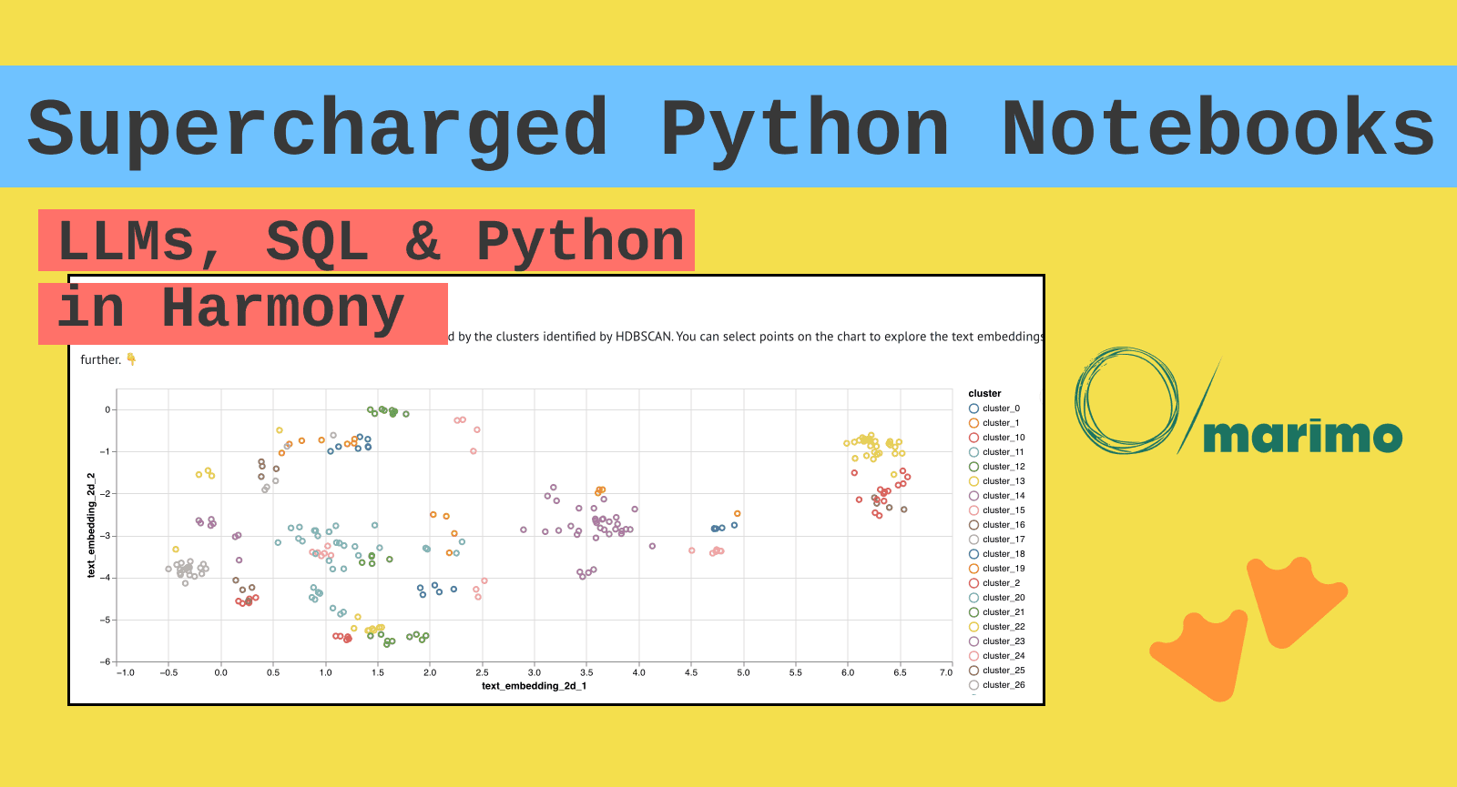 The MotherDuck team's embeddings explorer is the cleanest single example of the "AI artifact you can poke at in a notebook" genre that has arguably replaced the static dashboard as the dataviz unit of 2026. You feed it a column of text, it embeds, projects with UMAP, and gives you a scatter plot you can scrub through. The interesting design choice is that the notebook is the visualization — there's no "publish to dashboard" step, because Marimo and DuckDB collapse that distinction.
5. Using data visualization to understand how LLMs "think" — Enrico Bertini
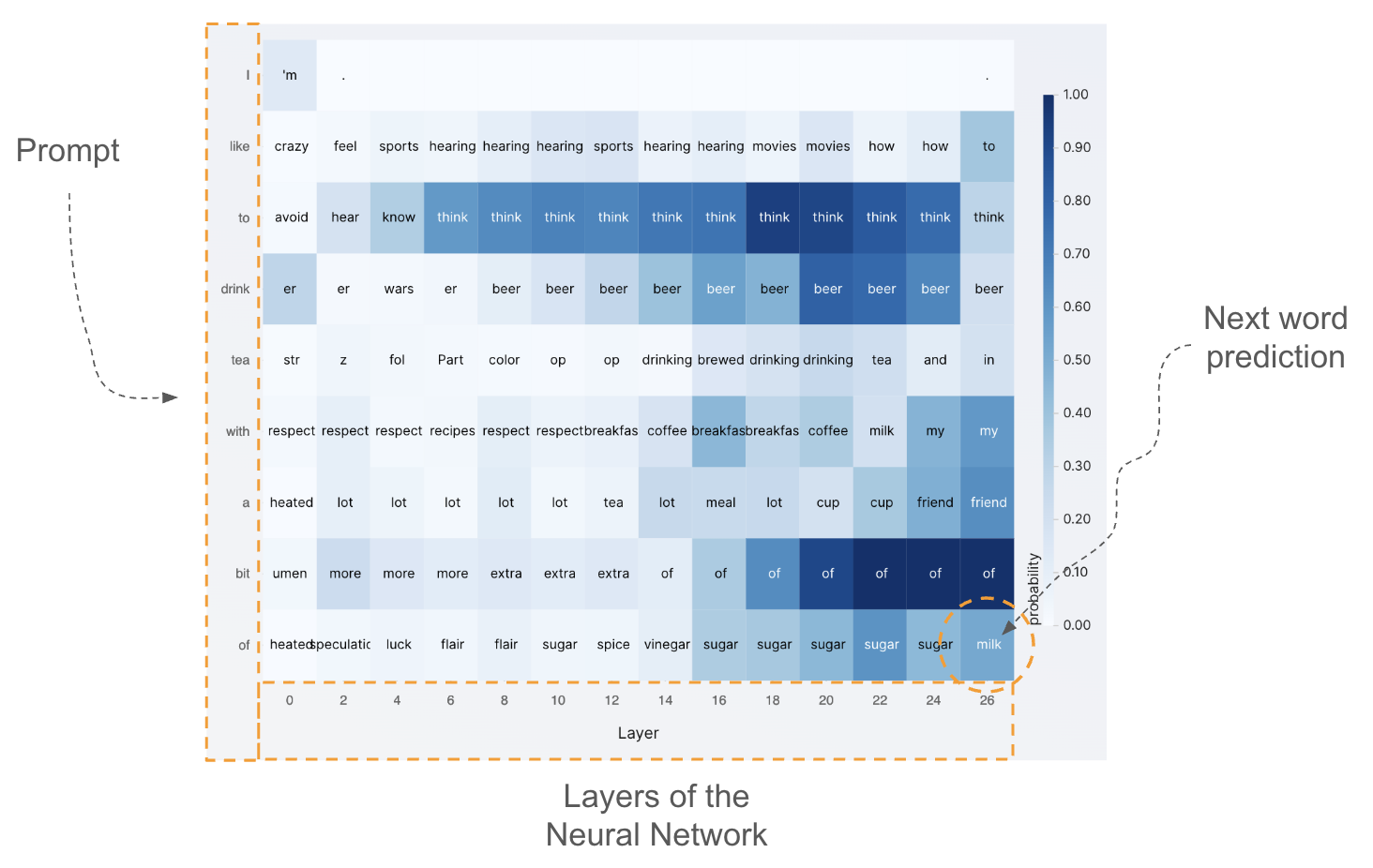 NYU professor and FILWD host Enrico Bertini takes one of the most active research frontiers — mechanistic interpretability — and makes the case that visualization is how the field will actually understand what's happening inside an LLM. The piece walks through visualizations from David Bau's group at Northeastern and others, showing how dataviz is becoming the working microscope for the AI black box. Of all the pieces on this list, this is the one most likely to age into a foundational reference.
The 5 people behind the work
These are the authors the link graph trusts most among voices that publish data viz on the open web.
1. Andrew Heiss — Georgia State assistant professor and the working tutorial author of record for the R / ggplot / Quarto / Observable Plot stack. 60 posts in our corpus. If you ever wanted to know how to fill a map with a density gradient, render a Venn diagram of R² in regression, or animate the four dplyr verbs (Viz #2 above), Heiss has shipped the canonical walk-through.
2. Claus Wilke — UT Austin professor, author of Fundamentals of Data Visualization (O'Reilly, 2019). His blog reads like the senior-IC counterpart to a Wilke textbook chapter: each post explains one chart-design principle by walking through an actual visualization decision he made.
3. Tobias Macey — Host of the Data Engineering Podcast. 509 episodes deep, and the interview-of-record for vendors and practitioners building visualization-adjacent infrastructure: dbt, Tableau, ThoughtSpot, Hex, Snowflake's data-app surface. If a dataviz product matters, Macey has interviewed its founder.
4. Brian T. O'Neill — Host of Designing for Analytics, the longest-running podcast on data-product UX. 85 episodes on what happens when your chart has a beautiful design but the surrounding application is unusable. The person quoted when someone needs to argue that you can't visualize your way out of a bad product.
5. Mathias Schäfer — The practitioner. His agency built the WHO data.who.int dashboard (Viz #1 above), the GED VIZ tool for the Bertelsmann Foundation, and several other commission-grade interactive pieces. The rare working-shop principal who also writes the design retrospectives.
The 5 articles worth catching up on
If you read one piece of data-viz writing this month, make it one of these.
1. Teaching data visualization in the time of generative AI — Claus Wilke. What do you do with the dataviz classroom when students can ask Claude to render a chart for them? Wilke takes the prompt seriously rather than dismissing it. Required reading for anyone teaching the subject in 2026.
2. Modern Data Visualization with Robert Kosara — Software Engineering Daily. An interview with the Tableau Research veteran (formerly of Eagereyes.org). Kosara's thesis — that most "modern" dashboards are really 1980s business graphics with a fresh paintjob — is one of the few takes that takes the field's history seriously.
3. The Collaborative Blueprint: The Open Visualization Academy as a Community of Learning and Friendship — Alberto Cairo, in Nightingale. The Knight Chair at Miami announcing his free Open Visualization Academy. The field's senior practitioner explaining how he intends to replace tuition-gated coursework with a Creative Commons library.
4. Episode 140 — Why Data Visualization Alone Doesn't Fix UI/UX Design Problems in Analytical Data Products — Brian T. O'Neill. The unfashionable take this list needs: visualizations live or die by the UI/UX scaffolding around them. The interview with T from Data Rocks NZ is a clinic in why dashboards fail in the wild.
5. The history of data journalism — Brant Houston, datajournalism.com. The European Journalism Centre's canonical "where did we come from" long-form. Pairs naturally with #3 — Houston tells the story of how we got here, Cairo's piece is about where we're going.
A note on how we picked these
The rankings come from PageRank-style citation scores Skillenai computes from the cross-document link graph — the same family of metrics Google's been refining for two decades. We restricted to posts that mention a data-visualization phrase, filtered out a handful of known-noisy sources, and let the scores decide. Full methodology, reproducible queries, and the per-pick data are in the GitHub notebook.